Friday, September 17, 2010

The fine art of scribbling

 
It's called gesture drawing, and I never really thought about it as being anything remarkable. I thought of them as warmups, just something to do before going to work on the "real" drawings. I generally didn't even bother to bring them home, I just pitched them in the recycle bin at the school. Then, two things happened. (1) Earlier this summer, I was at a group show where folks had framed their gesture drawings, put price tags on them, and hung them in a gallery; and (2) I found out that there are students - full-time art students in their final year at Sheridan, so people who know their stuff - who list gesture drawings as one of the most frustrating and difficult things to do. At this point, I'm thinking to myself, "Dang, I gotta start keeping some of that stuff."

So I'm learning to respect the fine art of scribbling. And in the drawing department, there are a couple of things I think I'm pretty good at, and gesture drawing is one of them. Not that I have any special talent, this is a skill that anyone can develop if they practice at it, and put down a few hundreds of these.

When I'm doing a gesture drawing, I start with a few seconds of observation, to get a feel for the pose, about what it would feel like to be in that pose, where the tension is, where the weight is, and where the energy is.  I do all this on a gut-level, not any kind of thinking or analysis... when the pose is only a minute or two long there's not really any time for that.

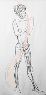
Once I am ready to draw, I spent a few seconds exploring the page and the pose, moving my arm over the paper although I might not start making marks right away. First I check how much room I have on the page, and where the edges of the page are compared to where the farthest out points of the pose are. Then I start with a light mark that will be the frame for the drawing. For the drawings on this post, I've highlighted the first mark I made on each page. Usually it's a swish of a line, the "line of action" as they say. As you can tell, this doesn't really correspond to the spine or to the centre of the figure. It's closest to being a description of the angles of the dominant masses of the figure. If the drawing was an essay, this first line would be the premise. It defines what the page is about.

Once the first line is down, I start putting in lines that support the premise, describing the major masses, starting with the biggest ones and moving out from there. 
 
A gesture drawing is about the tension and energy of the pose. It's not about getting a likeness of the model, it's about getting the attitude they're showing. When you're doing gestures of a good model, then any one of them could be the starting point for a story.

At least, that's the way I approach it. I'm not saying that there's a particularly right or wrong way to do it, just that this is how I do it, and it has worked out pretty well for me so far. See it, Feel it, Draw it. In that order - and that is the important bit.

P.S. Check out http://holmesinccomic.wordpress.com/2011/08/22/gesture-drawings/ for an update to this post.

Thursday, September 9, 2010

Ta-Daaaa! It's a contest entry!

original pencils - rough and dirty!
Here's the final submission from my blog post last month about the Captain Canuck 35th anniversary art contst. I knew going into this that I wanted to do an old-school homage rather than a reinvention. As mentioned in my earlier post, I wanted something with drama, and picked as the theme of my entry what is probably the most dramatic and tragic moment in the character's history. This also meant that I already knew a bunch of the elements that needed to show up, i.e. a hit from behind; some hostages, some nuclear threat, and somewhere in the panel the gun that is going to show up again and be used later in the story. I put the camera angle way off kilter to really pump up how much the ground has just been yanked out from under Captain Canuck, what with his own partner being the mole he'd been looking for.

I also knew that I wanted to draw this as an interior page, not a cover. So that influenced the positioning of the elements on the page. I knew that as an additional homage to the 1970s origins, I'd letter by hand, so the sound effect and dialogue balloons were part of the composition from the beginning.

Originally I had Blue Fox monologuing a bit, but in the end I felt that took away too much from the dramatic tension of the moment, and it really wasn't needed. But in my head, on the previous page is the "bwah-ha-ha, little did you know..." villain speech, and  the "bwah-ha-ha, I've got you where I want you now, and here's my evil plan" speech is on the next page.

I thought about going back in and cleaning up my pencil work a bit,  but since I was doing my own inks here I figured I'd just jump right to it and do the cleaning and inking at the same time.

I inked this in a combination of Micron Pigma pens (size 03, 05 and 1) a Staedtler Lumocolor (which I usually only use for drawing on film or animation cels, but it was handy and the right thickness), and my trusty Pentel pocket penbrush. My pocket penbrush is one of my favourite things I have. It's part cartridge pen, part paintbrush, and all awesome. It's actually a bristle brush, not just a marker shaped like a brush, and it's refillable.

As this is an homage to a 70's event, I decided to keep the tech advanced but consistent with the era, so I used the murky brown walls and the green screens for the computer displays. I kept the backgrounds dark, similar in values, and slightly desaturated so that the main characters would really pop. I also added a touch more light and dark contrast for the elements that were important to the plot, ie the hostages, the big bad button, and the gun.  Finally, I kept the colours for the two main characters fairly pure. I'm okay with the way it turned out. It's not great, and of course I don't expect to win any prizes for this, unless they end up having a "thanks for participating" prize. But in the end, I produced something that I'm not embarassed that it's going to be put in front of Richard Comely. So I'll chalk that up in the "win" column.

In the meantime, I'm registered for anatomy and pencilling classes with the Toronto Cartoonists Workshop. I figure I'm about one course away from not sucking at drawing. Which is pretty good progress.

Wednesday, September 1, 2010

Hands down, the coolest thing I have done to date, part 2

Shortly after Holmes Incorporated was announced as the subject for Toronto Cartoonists Workshop Fit to Print project, and after the character bible was provided to the participants, I was at the opera and the patron one row ahead of me and a few seats over bore a striking resemblance to what I saw in my mind when I read the description for one of the characters.
During the intermissions, I jotted down a few more quick sketches. Not the dude with the guitar, although he'll likely turn up at some point in future work. The other dude.


Not the mousy dude.

The other dude.


Yeah, that's right. I drew him three times and he didn't notice me, because I'm that fast. I love the character of the mousy dude, and I will definitely use him for something else. But this time around, I wanted the smiling, moustachio-ed, aquiline-nosed other dude as a model for the elder statesman at Holmes Incorporated. Technically, the opera patron had a beard as well as a moustache, and that is in the quick life sketches, but I dropped it at the character designing stage.

Based on these visual notes from my sketchbook, I worked up a more finished drawing to present at our weekly artists' meeting. This is Col-Erase light blue, touched up with Col-Erase blue and regular H pencil on regular photocopy paper. It was close enough to what Ty Templeton, our teacher, editor and the creator of the characters, had in mind for the character that I got to do the final designs.

The final character turnaround was based on my proposal and incorporated some elements that Rob Pincombe, one of the other contributors to Holmes Inc #1 (and the assistant editor of Holmes Inc #2), had initally proposed for "Old Edgar" (this character's father) but ended up fitting better with Sherlock II.


When I went to draw the head turnarounds, I wanted to do the full 360-degree rotation. On this copy, you can see the tickmarks between the drawings that I used to line up the major landmarks to make sure that the head size and feature placement stayed consistent. I started with the 3/4 view facing left, the lower left-hand side drawing. This was on 9x12 drawing paper. Then I cut the paper lengthwise in two strips and taped it together so I had one long strip, so it would be easier to line up the drawings for the back of the head.

Once I had the face figured out, I did a full-figure turnaround as well. This is also on 9x12 drawing paper.

I did the same thing on this set with the tickmarks and lines to make sure I was drawing the same dude at each stage of the rotation, but they didn't show on the scan because I made the lines in non-photo blue.


Handsome devil, isn't he?

He's all stylish and stuff what with being the public face of the agency, and the character who most closely physically resembles the master detective, even though he doesn't have the mystery-solving skill set so much. And you can tell not all of his days in action are behind him! He's fighting trim, and has a bit of muscle under that Armani suit.

I'm completely tickled that the first image I had in mind ended up making it into the project. And hey, Other Dude, I hope you don't mind that you're now a comic book character in a continuing series.