Wednesday, December 29, 2010

I'm back

Okay, yeah. I didn't post the other week. This is mostly because I hated every single mark I put down on paper for a couple of weeks running. There was a final assignment for my class up in there, too. Loved the class. Hated my last drawing. I showed it to my teacher, but only because I had to.  I tried to weasel out of showing it in the class. But it's over and done with now.

Here's the thing. Sometimes drawing goes like that. When it does, you just have to plow through it, make a bunch of crappy, stiff, awkward drawings and throw them in the fire. If you've done a lot of drawing, you know what I mean. If you're just getting started, then just know when it does happen to you (and it will), it's not the end of the world, and it's not worth pitching a fit over. It's just the drawing equivalent of "no pain, no gain." And it's probably not as bad as you think.

I find it usually happens to me when I'm trying to process new information, and with the classes I was taking there was a whole lot of new information to process.  Yeah, it happens often enough that I've detected a pattern. It just takes a while for the hands to catch up with the brains, especially if the hands have been used to doing things their own way for a while. The good news is that if you keep persistent then the motor skills do catch up. And by the way, don't throw anything in the fire right away, because if you set them aside for a month or so and then look again, you just might see your learning curve.

Practice sketches

So, of course, right after this I jumped into the arena for artist Battle Royal over at Outcast Studios. I knew that I'd never make it out of the first round, but that wasn't really the point.

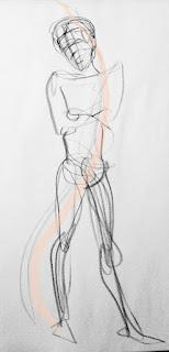
I had picked She-Hulk as my character for the fight, and with the luck of the draw got thrown up against Lobo. With that being the case, I figured it would be a hand-to-hand combat situation. I checked out some photo reference for martial arts and MMA and started doing some quick gestures on 9x12 sketch paper. I found a pretty good photo of a throw, but once I'd gestured it out, even though the mannequin matched the photo, it felt like my lady's pose was a little too scared. It looked like she was defending against a leap, rather than following through on a throw. So I thought about baseball, and came up with a pose I was happy with.

Fixing the poses

Once I had the main characters' poses figured out, I settled on a camera angle that I thought would work. I figured that since Lobo is pretty bad news in the DC universe, if he showed up in the Marvel universe, it wouldn't be a girl fight. A guy that has killed off his whole planet would pretty likely get all of the Avengers involved.

The official tournament rules specifically stated that any Avenger could call in the whole assembly.  As previously mentioned, I knew I would only have one shot at this, so I figured I'd go crazy with it, and do just that, and throw down with as much of the core team as I could recognizably fit in there.

Fixing the narrative


While I was roughing out, I realized that I had the storytelling backwards, so I dropped the drawing on a lightbox and did a quick trace job to reverse the layout so that She-Hulk would have the dominant spot. Even though she's farther back, and therefore smaller, she's on the left hand side of the page, which gets her noticed first by most people who follow the Western alphabet.

I plotted out the perspective grid with careful math and geometry and stuff, with the convergence point just under She-Hulk's knee, and arranged all the other page elements so that they were either moving toward her, or looking at her, or in Lobo's case, moving away from her. But she's still the center of gravity here, and the story of the page is all about her.

Once I finally got all of that sorted out, I went to full-scale 11x17 comic art board.

Right about there was where I decided to play to my naturally cartoony drawing style. Then it got silly. Here come all the Avengers, all geared up for a big battle, and it turns out to be nothing. Squirrel Girl came out a little more sinister than I intended, but it's all in good fun.

So, yeah. Turns out, it's a girl fight.

Bringin' it

Of course I did not win the art battle. But I drew something I don't hate, and that's worth something.

Sunday, December 5, 2010

Get ready... get set... DRAW!

 I came across Outcast Studios and the Daily Sketch Challenge this week in deviantArt, and figured I would give it a go. The idea is that the moderator selects a character, posts some reference, and then the members of the group draw that character and post their art within 36 hours. The intention is to spend 15-30 minutes on the drawing. I tended to go over the time limit, but based on some of the other drawings on the board, I might not be the only one. Or maybe the other people are all just crazy-fast and awesome.  

Monday's challenge was Firestar. 

I went way over on this by the time I was done inking it, although the initial pencil work probably fell more or less within the 30 minutes. I was pretty happy with the way it turned out, especially the fire effects. And she's more or less in proportion. I didn't use any reference for this, other than to double-check the costume once I'd roughed out the pose.


Tuesday's challenge was The Monarch. He's a villain from The Venture Brothers, which I've heard of but have never seen. I guess this is more or less what the character looks like, though. Again, I went longer than the 1/2 hour by the time I'd inked it up, but the rough drawing was done in about 15-20 minutes.


Wednesday was Hwoarang, a character from Tekken. Again, this was not a character that I was familiar with before he came up as the challenge topic. I'll likely revisit this one when I have more time. There are a lot of neat details on his costume to play around with, so I'd like to do up a nice, clean  drawing and fully render it up with colours and all. 

I used a photo reference from a Tae Kwon Do competition to get the pose for this, but only drew a quick rough stick figure from the photo to get the pose and angle down, then I made up the actual figure, then I checked the character reference to get the costume right. So I'd say this is about 80% from my imagination, and 20% checking reference material.


Thursday's challenge was "The Coon",
in which Cartman plays South Park's answer to Rorschach and other assorted costumed heroes.  I at least knew South Park, and Cartman, although I hadn't seen this episode until I googled it so I would know what was going on. Other than spending the extra half-hour on 'reference' this one totally fell within the time... mostly because I didn't try to ink it.


Friday's challenge was Dexter's Lab. But I was busy on Friday so I didn't get to it until Saturday morning. This one was finished within the half hour, which was a good thing, because I barely made the deadline as it was. If I had taken any longer on the drawing I wouldn't have made it in. 


This character, I know. I watched the cartoon when it was on, and have been kind of a fan of Genndy Tartakovsky in general, so this one was relatively easy for me.


I knew right away that I wanted to do a robot-suit version of him, mostly to challenge myself because I'm kind of bad at drawing tech, but also just because robots are cool.


The pose here is a little bit inspired by a Lego mecha although they look nothing alike. The robot is from one of the bits that the show used to bump to commercial.


I'd encourage any other artist to get in on this group, either in deviantArt or on the Outcast Studios forum. The daily sketch challenge group is nice and supportive, so it's a very safe place to get used to showing your stuff. Having something like this has been great in getting me to pick up the pencil and try something new, every day. And that's really the important part, if you want to be any good at drawing.


Pick up your pencil.


Draw.


Every day.

Saturday, November 27, 2010

What the what?

I dare you to draw me!
I like to go to proper classical life drawing sessions, but sometimes it's fun to just kick back and do something different. Being in Toronto, I'm lucky enough to have some options available to me.  One of them is the Toronto branch of Dr. Sketchy's.  The poses are short, the models are burlesque dancers and the like, so there are fun costumes to work with, there are contests during the session and there's always a fun playlist to work to. Also, it's at a pub so you can have a pint or a cocktail and chat with your friends between poses.

For one reason or another, I hadn't been able to go for a long time, so it was fun to get back to it the the other week. The model was Mena Von Fleisch, expectant with twins, and she was fantastic. I did some drawings that turned out okay, and generally just had a great time. 

Her first costume included a very angry-looking skull and giant skeleton hands and feet.

Speaking of contests, here are my contest entries from the night.

The first  one was a one-minute pose that I tinkered with between poses and between sets, and I submitted it at the end of the night as my "best of the night" entry. 

The other one was a five-minute pose, with an additional three minutes to come up with our best incorporation of a monster. I was just happy that the monster was recognizable enough that I didn't have to explain who it is supposed to be. And it got some applause from the crowd, which was nice.

After I got home from the session, I uploaded these drawings to the Facebook group page for Dr Sketchy's Toronto. The model liked them, and tagged herself, which was also nice. 

A few days later when I tried to connect to Facebook I had about eight warning alerts that I had violated the terms of service for Facebook by uploading offensive material.  Both drawings were deleted by the Facebook admins. As near as I can figure, the perceived nudity is what set someone off and got the drawings reported. (For the record, the model's costume included sequined pasties, so technically there is no nudity here.) 

tutu = not scary
Keela Watts, the model at the following session, was generally less threatening to those with easily offended eyeballs.  Her costumes covered the more alarming body parts, at least.

The model was great, had a fantastic and charming energy, and the session was a lot of fun.


Here's the really interesting bit. I've been doing life drawing for a while (like, years) and have uploaded my work to my Facebook photo gallery before this with never a batted eyelash. For example, these drawings here, with actually nude models had been up for a year and a half. 


I've taken them off my Facebook life drawing gallery now, so they just live here on my blog or over on my deviantArt gallery.


Personally, I don't get it. The human form is marvelous and complex, and I don't get how creating something that shows that would never be perceived as threatening or offensive. But there are a lot of things about the world that I don't get. But I guess that's what makes me so darned controversial.  Imagine that! Little old me. I guess now I'm a real artist.

Sunday, November 14, 2010

That went longer than planned, but better than expected

Yeah. That's better.
Before
I finally finished my three-page narrative assignment for the expressive anatomy class. Only two weeks late. Too much going on at my day job and in my real life. Also, I came down with another dang flu bug. (Really, immune system? Really?)

Page one was actually done on time, although I decided later that the decision to have Sally's hand outside the panel border and her cape inside it was a dumb one. The drawing doesn't make sense, so I tweaked it since then.  She's more legitimately flying into the story now.

Don't try this at home.
We had some time in class to work on the rest of the pages. Unfortunately, page 2 didn't turn out as well. Even while I was working on it, I realized I had totally misplaced the video store, which is only the most important element on the page, when I was plotting my layout. It ended up way too far to the left hand side, almost into the bleed, and it was too far in the distance and therefore too small. Also, one of the narrative elements I planned for the panel was to put a hipster taking a video of the Godzilla attack with their iPhone because that's the kind of thing a West Queen West hipster would do when faced with a Godzilla attack. But the only spot I had for it in the composition blocked the already obscured and too-small video store. So between that and the stuff in panels 1-3 that didn't thrill me, I had to redo most of the page. I worked out the frustration over this by drawing a hooker on fire and a naked guy running in the other direction with his junk flopping around* because I knew I would be scrapping the page anyway, and because hey, let's face it, this is Parkdale**. 
(*junk not actually drawn to a level of detail that is easily identifed, but I'm sure you can use your imagination. **not quite Parkdale, which starts a few blocks to the west.)
The new page 2.
Now with 100%
less hookers on fire

 In the end, I went back to my friendly local independent video store, and took some more photo reference so I could put it more into the spotlight, and also give the last frame some better context and a bigger reaction, based on feedback I got from the instructor on the first draft.  I shot it from a low angle, because the idea of the boy mirroring Godzilla's pose in panel 3 with his own triumphant pose in panel 4 made me smile.  And while I was doing the extreme page 2 makeover, I fixed the wonky perspective on the backgrounds in panels 1-3. And I gave Sally a better science station. And I threw in a CP-24 news helicopter because it seemed like a good idea. And it's hard to tell from this, but I tossed in a DNA ladder on the bulletin board.

The fact that Godzilla seems to be squishing my other school here is completely unintentional. It's just collateral damage based on where the video store is.


And, here's page 3. There aren't draft versions of this, because I mostly just worked in non-photo blue and did a lot of erasing. I'm more or less happy with how it turned out, but I'm going to lose all the heavy black up top behind panels two and three. I was torn for a while between having the fight take place at the CNE grounds vs. Ontario Place. I picked the more useless of the two to take the hit. So yes, this one was squished on purpose. If anyone from Ontario Place sees this, I can only assume you'd side with me on this one.

The biggest challenge was actually the damn boat. I guess I should add the jibline to it. I kind of forgot to draw that part. But what I like about this is that Godzilla is flying out of the last panel of the last page, which gives a nice overall bookend symmetry to Sally flying into the first panel of the first page.


Even considering the mistakes I made along the way, I'm surprised these pages turned out as well as they did. Maybe I'm starting to get the hang of this whole drawing thing.

Friday, October 22, 2010

What I'm learning at school


Well, I've realized one thing this week: class on Wednesdays and Thursdays does not make mid-week blogging very easy. I will probably move my blogging day to the weekend during the rest of the term. We'll see how it goes, part of it has been my previously-mentioned volunteering at TIFF and subsequent battle with the Flu of Doom. And now, of course, fiscal year-end at my day job is kind of eating my life. But I still have been drawing, in spite of all that, even if pretty much all of my drawing lately has been school-related. 

Here's something I finished this week, we had an assignment on facial expressions the other week, which I did rough blue lines at the time and then this past week I inked it. I was experimenting with different tools and techniques rather than going for a consistent style through the pages. I meant to trace a head and then use a lightbox to keep the head sizes consistent at least, but I forgot to do it, so the original is a bit wonky. This version has been edited a little in Photoshop. I'm happy with both characters' acting, anyway, which was the point of the exercise. There's no need to guess what either of them is feeling in any frame, I don't think.


This one here is an in-class exercise we did the other week on expressing emotion. The emotion was sadness. Sure this comes out more angsty than sad, but it gets the idea across. I drew a quick pencil sketch at class, then inked over it and cleaned it up a bit when I got home. This is 100% made up, no photo reference or model or anything like that, although I did take the pose a couple of times myself and then drew how it felt. So of course, the light source is also invented. I kind of like how it turned out.

For the next (and final) week of this class, there's a three-page story to draw. So, chances are next week's post will be about the final versions of what's showing in these rough layouts. Sneak preview, much?

 That's all I've got for now. It's time to make with the drawings.

Wednesday, October 13, 2010

Hello, ladies

Well, between TIFF and the epic flu I got after TIFF, and the two drawing classes I'm taknig at Toronto Cartoonists Workshop, my blogging schedule got pretty messed up. Hopefully I can get back on track now.

Most of my drawing lately has been course-related, class exercises and stuff. (We won't mention either of the 24-hour comic attempts, which resulted both times in way more sleeping than producing.)

But I have been working on some character designs for some female characters. It started with the cowboy story. I still didn't have a visual on the female lead in that one, and was having a hard time getting to the script without knowing what the character looks like. All I had was that I knew she was a scientist/inventor and smarter than the rest of the characters put together, and the cowboy is still in love with her.

When I was trying to come up with a concept, other than the above, I thought to myself, "OK, I have my hero, I have my sidekick, now all I need is my steampunk vixen."

Light bulb.

Steampunk vixen? 

Yes, please! That needs to be its own series.That is absolutely something that needs to exist in the world.

 And you know what's better than a steampunk vixen? Naturally, three Steampunk Vixens! A pirate, a courtesan, and an engineer. It's like Charlie's Angels meets Jules Verne. And I can't wait to draw it. I'm plotting out some of the character background/origin story points for issue 1. Now all I need is some help from smarter people than me to write the rest of it, especially the engineering science-y stuff.

This won't be my first project though. I want to have some practice before I tackle it.

Speaking of which, OK I will mention the failed 24-hour comic attempts. I'll still do the story because it's kinda fun. At least I think it is. I just won't do it in 24 hours, that's pretty much a given at this point. It'll be good practice at drawing, even though the whole deadline thing didn't work out so well for me. I don't have any visuals on it yet, but I do have an outline and am partway through a page breakdown. (Yeah. two tries at it and I only got an outline and partway through a page breakdown. I had the flu, OK? I thought I was better the week after but I really wasn't.)


I'm also going to do the cowboy story. I did finally get a visual on the female lead. I know the perspective is all wonky in the lab equipment in this sketch, and the verticals aren't quite vertical. I'll do up some proper drawings of her, and a character sheet for her. 

In the meantime, this is a rare instance of me making a drawing and liking it right away. I usually hate anything I make until at least the day after I make it. I've actually had to make a rule with myself that I can't throw anything away the day I make it, or I'd never keep anything.

This one, though? This one was a keeper from the minute I set down the pencil. Hello, Trixie. Nice to see you.

Saturday, October 9, 2010

Mulligan!

OK, my participation in the official 24 hour comics day was a flu-induced train wreck. Now I am flu-free and full of caffeine, and ready to make another go of it. Will I succeed? only time will tell...

What I have so far, my list of "audience suggestions" from the fabulous Infinite Improbability Drive widget at the H2G2 Wiki site:

Non-geographic numbers http://ezinearticles.com/?Benefits-of-Non-Geographic-Numbers&id=4906154
Magnetism http://www.bbc.co.uk/dna/h2g2/A767162
...Tractor Pulls http://www.bbc.co.uk/dna/h2g2/A281594
Organic Food http://www.bbc.co.uk/dna/h2g2/A575679
The Berlin Airlift http://www.bbc.co.uk/dna/h2g2/A638976
Eddie Irvine, Formula One driver http://www.bbc.co.uk/dna/h2g2/A307405
Sauna Whisk (Finnish skin care / exfoliation) http://www.bbc.co.uk/dna/h2g2/A902558
Blairgowrie, Perthshire, Scotland, UK (farming village famous for raspberry growing) http://www.bbc.co.uk/dna/h2g2/A1149293
Malaysian Teapot Worship - The Ayah Pin Cult http://www.bbc.co.uk/dna/h2g2/A38083476
the Higgs boson (Particle Physics - a hypothetical particle, yet to be detected, which explains why other particles have mass) http://www.bbc.co.uk/dna/h2g2/A851429
William Dampier - Pirate, Explorer and Naturalist http://www.bbc.co.uk/dna/h2g2/A15883374

 and the resulting story thread so far:

There is a rivalry between Farmer Brown and Old MacDonald.
Old Mac has one of every kind of animal. One, very virile male of every animal, and a successful stud service. Old Mac is an animal pimp. He also has a kid at CERN, who has managed to detect and harness the
elusive Higgs boson. Because of ...this, they have pimped up their ride (tractor) and can control its mass, which makes it nigh-on invincible at the tractor pulls.
Farmer Brown, he has a dog. Of course. He also has a boutique organic produce farm. And he has a secret weapon...

I will continue to incorporate as much of the original suggestion list as I can, and post the results to my DeviantART gallery at http://rockie-squirrel.deviantart.com/

Friday, September 17, 2010

The fine art of scribbling

 
It's called gesture drawing, and I never really thought about it as being anything remarkable. I thought of them as warmups, just something to do before going to work on the "real" drawings. I generally didn't even bother to bring them home, I just pitched them in the recycle bin at the school. Then, two things happened. (1) Earlier this summer, I was at a group show where folks had framed their gesture drawings, put price tags on them, and hung them in a gallery; and (2) I found out that there are students - full-time art students in their final year at Sheridan, so people who know their stuff - who list gesture drawings as one of the most frustrating and difficult things to do. At this point, I'm thinking to myself, "Dang, I gotta start keeping some of that stuff."

So I'm learning to respect the fine art of scribbling. And in the drawing department, there are a couple of things I think I'm pretty good at, and gesture drawing is one of them. Not that I have any special talent, this is a skill that anyone can develop if they practice at it, and put down a few hundreds of these.

When I'm doing a gesture drawing, I start with a few seconds of observation, to get a feel for the pose, about what it would feel like to be in that pose, where the tension is, where the weight is, and where the energy is.  I do all this on a gut-level, not any kind of thinking or analysis... when the pose is only a minute or two long there's not really any time for that.

Once I am ready to draw, I spent a few seconds exploring the page and the pose, moving my arm over the paper although I might not start making marks right away. First I check how much room I have on the page, and where the edges of the page are compared to where the farthest out points of the pose are. Then I start with a light mark that will be the frame for the drawing. For the drawings on this post, I've highlighted the first mark I made on each page. Usually it's a swish of a line, the "line of action" as they say. As you can tell, this doesn't really correspond to the spine or to the centre of the figure. It's closest to being a description of the angles of the dominant masses of the figure. If the drawing was an essay, this first line would be the premise. It defines what the page is about.

Once the first line is down, I start putting in lines that support the premise, describing the major masses, starting with the biggest ones and moving out from there. 
 
A gesture drawing is about the tension and energy of the pose. It's not about getting a likeness of the model, it's about getting the attitude they're showing. When you're doing gestures of a good model, then any one of them could be the starting point for a story.

At least, that's the way I approach it. I'm not saying that there's a particularly right or wrong way to do it, just that this is how I do it, and it has worked out pretty well for me so far. See it, Feel it, Draw it. In that order - and that is the important bit.

P.S. Check out http://holmesinccomic.wordpress.com/2011/08/22/gesture-drawings/ for an update to this post.

Thursday, September 9, 2010

Ta-Daaaa! It's a contest entry!

original pencils - rough and dirty!
Here's the final submission from my blog post last month about the Captain Canuck 35th anniversary art contst. I knew going into this that I wanted to do an old-school homage rather than a reinvention. As mentioned in my earlier post, I wanted something with drama, and picked as the theme of my entry what is probably the most dramatic and tragic moment in the character's history. This also meant that I already knew a bunch of the elements that needed to show up, i.e. a hit from behind; some hostages, some nuclear threat, and somewhere in the panel the gun that is going to show up again and be used later in the story. I put the camera angle way off kilter to really pump up how much the ground has just been yanked out from under Captain Canuck, what with his own partner being the mole he'd been looking for.

I also knew that I wanted to draw this as an interior page, not a cover. So that influenced the positioning of the elements on the page. I knew that as an additional homage to the 1970s origins, I'd letter by hand, so the sound effect and dialogue balloons were part of the composition from the beginning.

Originally I had Blue Fox monologuing a bit, but in the end I felt that took away too much from the dramatic tension of the moment, and it really wasn't needed. But in my head, on the previous page is the "bwah-ha-ha, little did you know..." villain speech, and  the "bwah-ha-ha, I've got you where I want you now, and here's my evil plan" speech is on the next page.

I thought about going back in and cleaning up my pencil work a bit,  but since I was doing my own inks here I figured I'd just jump right to it and do the cleaning and inking at the same time.

I inked this in a combination of Micron Pigma pens (size 03, 05 and 1) a Staedtler Lumocolor (which I usually only use for drawing on film or animation cels, but it was handy and the right thickness), and my trusty Pentel pocket penbrush. My pocket penbrush is one of my favourite things I have. It's part cartridge pen, part paintbrush, and all awesome. It's actually a bristle brush, not just a marker shaped like a brush, and it's refillable.

As this is an homage to a 70's event, I decided to keep the tech advanced but consistent with the era, so I used the murky brown walls and the green screens for the computer displays. I kept the backgrounds dark, similar in values, and slightly desaturated so that the main characters would really pop. I also added a touch more light and dark contrast for the elements that were important to the plot, ie the hostages, the big bad button, and the gun.  Finally, I kept the colours for the two main characters fairly pure. I'm okay with the way it turned out. It's not great, and of course I don't expect to win any prizes for this, unless they end up having a "thanks for participating" prize. But in the end, I produced something that I'm not embarassed that it's going to be put in front of Richard Comely. So I'll chalk that up in the "win" column.

In the meantime, I'm registered for anatomy and pencilling classes with the Toronto Cartoonists Workshop. I figure I'm about one course away from not sucking at drawing. Which is pretty good progress.

Wednesday, September 1, 2010

Hands down, the coolest thing I have done to date, part 2

Shortly after Holmes Incorporated was announced as the subject for Toronto Cartoonists Workshop Fit to Print project, and after the character bible was provided to the participants, I was at the opera and the patron one row ahead of me and a few seats over bore a striking resemblance to what I saw in my mind when I read the description for one of the characters.
During the intermissions, I jotted down a few more quick sketches. Not the dude with the guitar, although he'll likely turn up at some point in future work. The other dude.


Not the mousy dude.

The other dude.


Yeah, that's right. I drew him three times and he didn't notice me, because I'm that fast. I love the character of the mousy dude, and I will definitely use him for something else. But this time around, I wanted the smiling, moustachio-ed, aquiline-nosed other dude as a model for the elder statesman at Holmes Incorporated. Technically, the opera patron had a beard as well as a moustache, and that is in the quick life sketches, but I dropped it at the character designing stage.

Based on these visual notes from my sketchbook, I worked up a more finished drawing to present at our weekly artists' meeting. This is Col-Erase light blue, touched up with Col-Erase blue and regular H pencil on regular photocopy paper. It was close enough to what Ty Templeton, our teacher, editor and the creator of the characters, had in mind for the character that I got to do the final designs.

The final character turnaround was based on my proposal and incorporated some elements that Rob Pincombe, one of the other contributors to Holmes Inc #1 (and the assistant editor of Holmes Inc #2), had initally proposed for "Old Edgar" (this character's father) but ended up fitting better with Sherlock II.


When I went to draw the head turnarounds, I wanted to do the full 360-degree rotation. On this copy, you can see the tickmarks between the drawings that I used to line up the major landmarks to make sure that the head size and feature placement stayed consistent. I started with the 3/4 view facing left, the lower left-hand side drawing. This was on 9x12 drawing paper. Then I cut the paper lengthwise in two strips and taped it together so I had one long strip, so it would be easier to line up the drawings for the back of the head.

Once I had the face figured out, I did a full-figure turnaround as well. This is also on 9x12 drawing paper.

I did the same thing on this set with the tickmarks and lines to make sure I was drawing the same dude at each stage of the rotation, but they didn't show on the scan because I made the lines in non-photo blue.


Handsome devil, isn't he?

He's all stylish and stuff what with being the public face of the agency, and the character who most closely physically resembles the master detective, even though he doesn't have the mystery-solving skill set so much. And you can tell not all of his days in action are behind him! He's fighting trim, and has a bit of muscle under that Armani suit.

I'm completely tickled that the first image I had in mind ended up making it into the project. And hey, Other Dude, I hope you don't mind that you're now a comic book character in a continuing series.

Wednesday, August 25, 2010

Hands down, the coolest thing I have done to date

This past spring, I had the opportunity to work with a group of students from Toronto Cartoonists Workshop, led by Ty Templeton, and through TCW's "Fit to Print" course, on a comic book that will be released at FanExpo this weekend. I'm still completely gobsmacked by the whole thing. I've never been to a Con before, so I'm not sure what to expect. I've got an equal amount of thrilled and terrified going on, salted with liberal amounts of "Wait .... what?"

The book is Holmes Incorporated, and you can read more about it here. It's two days until preview copies come out, and there will be a formal release party on September 24. Check here for information on how to get a copy of your very own.

I got to do the drawings for one of the stories.

 Here's how I decided what to put on the first two pages (you can see the final inked and lettered pages here - scroll down to "Spring Loaded."


The first thing I did when I got the script was to write down some notes and decide which panel I wanted to emphasize on each page.  Based on that decision, the other panels would all point to it, but would still have an overall forward narrative flow. For page one, the key panel was the one where the decision was made to send Trey on the undercover mission, so other than the primary panel 1 to panel 4 story flow, I did a secondary page composition with elements that would draw attention to panel 3, where the decision is made.

 
On page two the key panel was the one where the important clues were discovered, so the page composition draws attention to panel 3. But as you can see, I had some trouble otherwise with the panel composition, and there's a lot of weird dead space that doesn't make sense.

The artists had weekly meetings to present our work in progress for Ty's review and feedback.  My pages, in addition to the aforementioned weird dead space, which also happened even worse on a later page, I hadn't left enough room for dialogue, or made enough variation in the camera angle or distance. So I had another go.
I showed some more of the room in panel 1, added a character who I forgot had a line in panel 2, and moved Trey to the left hand side of the panel to give a lead to the next page, and also to give her room to break out of the panel.  She's so excited she can't contain herself, so the panel borders shouldn't contain her either. On page 2, so I decided to remove the medium shot with the clues popped up, and just draw two panels showing the clues themselves, with the character's comments in voice-over bubbles.

Then, based on more feedback that panel 1 should go back to the foreground/midground/background that my original thumbnails had, I made some final tweaks to the layout when I switched to doing the final pencils.  On page 2, I wanted to do fix the dead space problem, which also gave me a chance to add in a quick little establishing shot to show that we were in a new setting, showing the surveillance truck parked outside the campus before cutting to the truck interior and Trey getting ready for her mission. Panel one of the final pencilled page wasn't called for in the script, but I think it supports the story well. I also remembered the frame rule where cameos should be round, and switched up Trey's literal cameo in panel 3 of page 2. I forgot to draw panel 3 as a view-through the spy glasses which I had in my original thumbnail and layout, but it works anyway.


 That's kind of all I have for now. My mind is still a little blown.

Wednesday, August 18, 2010

Getting to know you


Preliminary character concept sketches
I'm working on getting a feel for the characters in my story so that when I get to actually writing I'll know who they are a bit. 

So now, for starters, knowing how a guy carries himself, and how he dresses, goes a certain distance to knowing what kind of a person he might be. I'll refine the designs as I develop the characters further, and I've drawn both of the main charcters too short here, but again it's a start.

The younger cowboy here has a casual, but prepared for a fight stance. So we can assume he's a bit brash. He's got a lasso but no gun so he's either Canadian or has recently spent time in Canada. (it's the latter.) He's generally clean, but in need of a shave and a haircut. I drew him that way because he's been on the run for a while.

The bartender doesn't count for much, because he's just a piece of the set. But if you look closely you can see where I drew his whole figure, behind the bar, to check my proportions and where the floor would go. I generally do that with my drawings anyway - include the bits that are behind other bits when I'm doing my initial sketches. Doing this helps me give a three-dimensional feel to the drawings.

The older guy, taciturn, grumpy, kinda stiff (stiff cause of old injuries, not cause of him being stuffy). I'll make sure he keeps the guarded body language and the big, old-guy ears when I do the design tweaks that this guy will need before I start drawing the pages.

I started a rough drawing of the lady in the book, but it turned out looking too much like Elektra so I scrapped it. I definitely have to get that stuff locked down soon, though.

I'm kind of working on the story outline and character designs at the same time here, because each one informs the other.

So, that's where we are this week. It's time to do a bit of writing so I'll have stuff to draw, and at the same time to do a bit of drawing so I'll know what to write down.

Wednesday, August 11, 2010

The story continues...

Thumbnails and notes for Curse of the WereOtters #1

When I'm working on my own stuff, as opposed to drawing something that someone else wrote, I tend to come up with bits of everything at once, so putting down some quick thumbnail sketches helps me focus, and figure out the story beats. At this stage, I'll make notes about what the scribbly lines are supposed to be, and jot down dialogue ideas if I think of some. I don't spend a lot of time on these, and don't worry about how messy the sketches are. At the thumbnail stage, I'm only looking at the story pace, what the beats are, and how much of the page each story beat will take up. It's a rough draft, with some rough draft notes. And having had a look at it, now I've realized that I'd like to move the two-page spread back a couple more pages and let the bar scene play out a little, and give the otters more time to get from the river to the town.

I figure I'll keep the nice, slow mosey pace going so that when the were-otters turn up the slam into action is more deliberate and more exciting. The story beats on page 3 will be spread out across the two new pages.

Moving on to the rough layouts, where I start putting some thought into panel and page composition, and camera angles. Page 2 here is pretty much the way I'm going to draw it.

Page 3, panels 1 and 2 won't change much. The rest of the page will be completely different. I'll add in some more info and character stuff on the rest of the page. So far, one of my favourite dialogue lines I've come up with will go on the last panel of page 2 and the first panel of page 3. It's my favourite because it gives all the back story you need to know in three sentences.

Chet:  I never stole them horses.
Hank: The whole rest of the county was down to the chapel, Chet. Trixie will never forgive you.

Bim, bam, boom, and on with the current story. As soon as I get the rest of the plot points figured out.