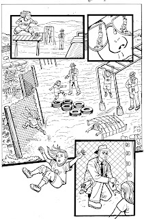
Showing posts with label Holmes Inc Comic. Show all posts

Saturday, August 11, 2012

An assortment of etchings

Okay, wow. I've been so busy drawing that I haven't had time to write an update about what I'm drawing!

But here's a character turnaround I did for Holmes Inc 3, which is just about to go to press (more on that next week).


I've still been sketching every day, and going to life drawing sessions as often as I can, although looking at my online art files it seems like most of it hasn't been scanned yet.
I'll do a blog post on different life drawing sessions before the end of the year, but for now here's a sketch based on a 2-minute pose with a model posing on circus hoops. 


Here's a couple of sketches from a "30-day original character challenge" that I did in June.


And now here we are at just under two weeks until FanExpo, and my first big show on my own. Am I excited? Yes. Am I more than a little terrified? Absolutely.

It'll be fine. Right? Sure. It'll be more than fine. It'll be awesome.

Fingers crossed  that it all goes OK. I'll be doing sketches, selling prints, and promoting my next project, Steampunk Vixens. You can keep up with that at www.steampunkvixens.com or follow the project on Twitter  or Facebook


Saturday, March 31, 2012

Keeping it Real part 2

In my last post, I talked about the importance of setting up a perspective grid as the first step in making an illustration.

The other important first step is research. (Exactly which of the two, grid vs research is step 1 and which is step 2 varies for me, depending on what I'm working on.)

Research can be looking up photos on the internet or visiting similar locations and taking photographs of my own. Either way, I'll collect a whole bunch of photos. And then I won't copy any of them, exactly. But I will use them to help me figure out what might be included in the background when I design my locations. If I do use photo reference, it's  as a reminder of what kinds of things are visible on a rooftop, for example, and then I make up my own versions of those things.

I looked up a whole bunch of reference photos for New York City rooftops for this, but I didn't use a single one of them verbatim (or whatever the photo version of "verbatim" woud be) I just used them to remind myself what kinds of things might be found on a roof.


Even if I am using my own photographs for a specific location, I won't make quite an exact copy. In this example, I copied but greatly simplified my photograph of the gates at Trinity Bellwoods Park to set up a specific location, including just enough detail to be recognizable and believable, but without being slavish to the photograph. I didn't want to put so much detail in the background that it became distracting, because the picture is about the white squirrel, not the park gates.


When I was working on Grawlix #2 (which got renumbered as #3 by the time it was released) I used a pillar from one room, and a table from another, and windows and  decorations that I completely made up, and combined them to design the bistro where our characters get together on page 2 of my story.


Set dressing helps to establish the story, and the character. You can use subtle details to support the story and move it forward, or to tell the reader something about the person in the room.

When I was given the job of designing the personal office space for Number Two in issue 2 of Holmes Incorporated, I looked up a lot of images on executive office space and furniture, as well as what other artists had drawn in issue 1.  

Then I took all of that, looked at all of it, and let it influence but not dictate my designs. I used what I already knew about the character to create a space that specifically appropriate to him.


Good background and props design provides an extra layer of communication and another reason for someone to re-read the story, and handled properly it can also help establish and maintain the pace of the story, guide the readers along, and help them get to know the people that inhabit the story world.

Saturday, March 17, 2012

Keeping it Real

OK, I know. I get it. 

Constructions and perspective grids are not the funnest, sexiest parts of making a piece of art. There's always a real temptation to skip this step and get right to the good bits of doing the drawing.

The little X is to remind myself which of these lines was the horizon
There's a saying in building things that applies as well to drawing: Measure twice, cut once.

If you take the time to carefully plan your drawing, you're less likely to have the artwork turn out wonky, or end up having to erase and re-draw a bunch of stuff because you accidentally used two different points of view on the same composition*

* and before you say "what about cubism" these rules apply double, or triple in that case, because each of the different points of view presented has to be consistent with itself.

It also helps to establish the settings of your drawings as a real place that people could visit.


When I'm doing constructions I mostly just hint at the location. I lay down the framework so that when I do the detailed illlustrations later, I have a basic idea where the characters are in the setting, and what details need to be added to create a sense of place.


If your viewers believe they could really go to the place where your characters are, then it will give them another way to connect with your story. At least, it seems that way to me.


Friday, July 22, 2011

Yeah. That just happened.

I wouldn't blame you for thinking that these credits are some kind of fangirl fantasy. But it's not. They're real, and they're in print.

Check out Ty Templeton's blog for more preview art and other awesomeness.

If you're in Toronto, and it's still before evening, you can come to the Toronto Cartoonists Workshop studio and check it out in person.

TORONTO CARTOONISTS WORKSHOP
587A College Street (Upstairs unit, College and Clinton)

If not, you can watch the Holmes Inc Comic site for how to order a copy in print or online.

Sunday, July 17, 2011

Almost there

After months of collaboration, and learning, and abject panic, Holmes Incorporated issue #2 is set to launch on Friday, July 22.

Working on this project has been terrifying and rewarding at the same time, and I can't wait to see the finished product.
If you happen to be in Toronto, please feel free to come by the school/studio space and say hi!

http://cartoonistsworkshop.wordpress.com/2011/06/29/weve-moved-open-house-and-holmes-inc-2-launch-party-on-july-22/

If not, you can check out the Holmes Inc Comic site or follow Holmes Incorporated on Twitter http://twitter.com/#!/holmes_inc for announcements about getting the book online.


Wednesday, June 22, 2011

The evolution of a page

Nothing to see here... but over at the Holmes Inc comic page, there is a tutorial and preview art by ME!...
Visit the Holmes Inc Comic site to check it out


Watch for Holmes Inc Issue #2, coming July 22.

Tuesday, June 21, 2011

Kaboom!


More promo art for Holmes Inc, inspired by Safe, the final story of Issue 2, coming your way in just a few weeks.

Also, check out today's tutorial on the Holmes Inc Comic site, by Aaron Feldman, the writer of Safe.


Wednesday, September 1, 2010

Hands down, the coolest thing I have done to date, part 2

Shortly after Holmes Incorporated was announced as the subject for Toronto Cartoonists Workshop Fit to Print project, and after the character bible was provided to the participants, I was at the opera and the patron one row ahead of me and a few seats over bore a striking resemblance to what I saw in my mind when I read the description for one of the characters.
During the intermissions, I jotted down a few more quick sketches. Not the dude with the guitar, although he'll likely turn up at some point in future work. The other dude.


Not the mousy dude.

The other dude.


Yeah, that's right. I drew him three times and he didn't notice me, because I'm that fast. I love the character of the mousy dude, and I will definitely use him for something else. But this time around, I wanted the smiling, moustachio-ed, aquiline-nosed other dude as a model for the elder statesman at Holmes Incorporated. Technically, the opera patron had a beard as well as a moustache, and that is in the quick life sketches, but I dropped it at the character designing stage.

Based on these visual notes from my sketchbook, I worked up a more finished drawing to present at our weekly artists' meeting. This is Col-Erase light blue, touched up with Col-Erase blue and regular H pencil on regular photocopy paper. It was close enough to what Ty Templeton, our teacher, editor and the creator of the characters, had in mind for the character that I got to do the final designs.

The final character turnaround was based on my proposal and incorporated some elements that Rob Pincombe, one of the other contributors to Holmes Inc #1 (and the assistant editor of Holmes Inc #2), had initally proposed for "Old Edgar" (this character's father) but ended up fitting better with Sherlock II.


When I went to draw the head turnarounds, I wanted to do the full 360-degree rotation. On this copy, you can see the tickmarks between the drawings that I used to line up the major landmarks to make sure that the head size and feature placement stayed consistent. I started with the 3/4 view facing left, the lower left-hand side drawing. This was on 9x12 drawing paper. Then I cut the paper lengthwise in two strips and taped it together so I had one long strip, so it would be easier to line up the drawings for the back of the head.

Once I had the face figured out, I did a full-figure turnaround as well. This is also on 9x12 drawing paper.

I did the same thing on this set with the tickmarks and lines to make sure I was drawing the same dude at each stage of the rotation, but they didn't show on the scan because I made the lines in non-photo blue.


Handsome devil, isn't he?

He's all stylish and stuff what with being the public face of the agency, and the character who most closely physically resembles the master detective, even though he doesn't have the mystery-solving skill set so much. And you can tell not all of his days in action are behind him! He's fighting trim, and has a bit of muscle under that Armani suit.

I'm completely tickled that the first image I had in mind ended up making it into the project. And hey, Other Dude, I hope you don't mind that you're now a comic book character in a continuing series.

Wednesday, August 25, 2010

Hands down, the coolest thing I have done to date

This past spring, I had the opportunity to work with a group of students from Toronto Cartoonists Workshop, led by Ty Templeton, and through TCW's "Fit to Print" course, on a comic book that will be released at FanExpo this weekend. I'm still completely gobsmacked by the whole thing. I've never been to a Con before, so I'm not sure what to expect. I've got an equal amount of thrilled and terrified going on, salted with liberal amounts of "Wait .... what?"

The book is Holmes Incorporated, and you can read more about it here. It's two days until preview copies come out, and there will be a formal release party on September 24. Check here for information on how to get a copy of your very own.

I got to do the drawings for one of the stories.

 Here's how I decided what to put on the first two pages (you can see the final inked and lettered pages here - scroll down to "Spring Loaded."


The first thing I did when I got the script was to write down some notes and decide which panel I wanted to emphasize on each page.  Based on that decision, the other panels would all point to it, but would still have an overall forward narrative flow. For page one, the key panel was the one where the decision was made to send Trey on the undercover mission, so other than the primary panel 1 to panel 4 story flow, I did a secondary page composition with elements that would draw attention to panel 3, where the decision is made.

 
On page two the key panel was the one where the important clues were discovered, so the page composition draws attention to panel 3. But as you can see, I had some trouble otherwise with the panel composition, and there's a lot of weird dead space that doesn't make sense.

The artists had weekly meetings to present our work in progress for Ty's review and feedback.  My pages, in addition to the aforementioned weird dead space, which also happened even worse on a later page, I hadn't left enough room for dialogue, or made enough variation in the camera angle or distance. So I had another go.
I showed some more of the room in panel 1, added a character who I forgot had a line in panel 2, and moved Trey to the left hand side of the panel to give a lead to the next page, and also to give her room to break out of the panel.  She's so excited she can't contain herself, so the panel borders shouldn't contain her either. On page 2, so I decided to remove the medium shot with the clues popped up, and just draw two panels showing the clues themselves, with the character's comments in voice-over bubbles.

Then, based on more feedback that panel 1 should go back to the foreground/midground/background that my original thumbnails had, I made some final tweaks to the layout when I switched to doing the final pencils.  On page 2, I wanted to do fix the dead space problem, which also gave me a chance to add in a quick little establishing shot to show that we were in a new setting, showing the surveillance truck parked outside the campus before cutting to the truck interior and Trey getting ready for her mission. Panel one of the final pencilled page wasn't called for in the script, but I think it supports the story well. I also remembered the frame rule where cameos should be round, and switched up Trey's literal cameo in panel 3 of page 2. I forgot to draw panel 3 as a view-through the spy glasses which I had in my original thumbnail and layout, but it works anyway.


 That's kind of all I have for now. My mind is still a little blown.